Qola Corp - A modern digital solution for a long-term care facility
Art Direction
Problem Discovery
Qola is a thriving tech company offering practical information and digital assessment technologies to people working in the aged care sector. the Organization has come up with a comprehensive assessment process designed to tease out the unique traits and requirements of long-term care facility residents.
The problem here was that customers often struggled to use the technology and care, and home staff, were forced to provide regular one-on-one training sessions.
Our mission was to find a way how to eliminate the need for costly and time-consuming training sessions.

Desgin Process
Research:
User Interviews
I did interviews with the nurses and residents to learn more about the customer journey.
I asked them what should they be feeling while interacting with particular touchpoints. Why was the original app so difficult to use? Were users digitally savvy, or did they require extra guidance?
Through the user interviews, we discovered that the app is unique in offering a dignified and people-centric approach to residential care assessments. For all its strong points, however, the existing app was difficult to navigate. As a result, customers often struggled to use the technology, and care, home staff, were forced to provide regular one-on-one training sessions.
Competitive Analysis

A robust system is great. But at what cost?
We Compared six competitors in the Electronic Health Record (EHR) space and focused on improving the existing digital touch points.
Challenge
When everything is important, nothing is important!
Many app designers forget to consider usability as their app grows and developers continue to add new features. This problem affected the Qola App. Having many pages and tools was the problem why navigating was very difficult.
To combat the issue, we let the Qola team know that they would have to start prioritising the experiences of their users and we did the user interviews. The Input of the user interviews we had was vital to the success of Qola’s project.
Strategy
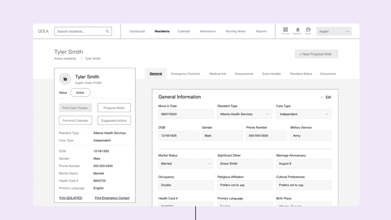
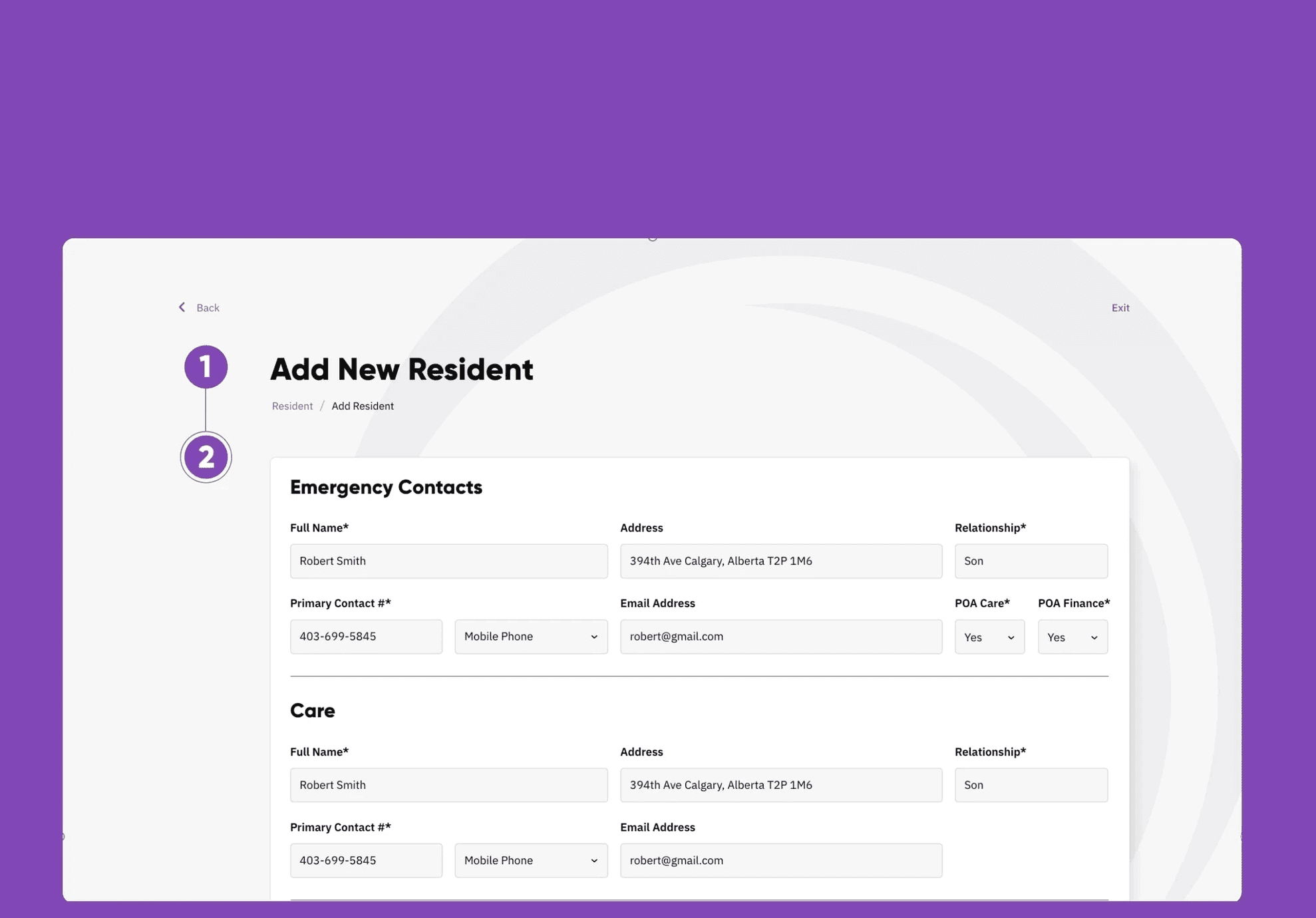
The first thing we noticed was that Qola’s application contained hundreds of models and pages of information and it was difficult to navigate.
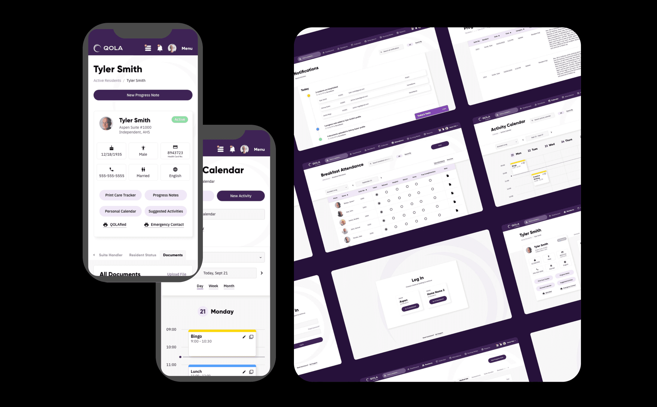
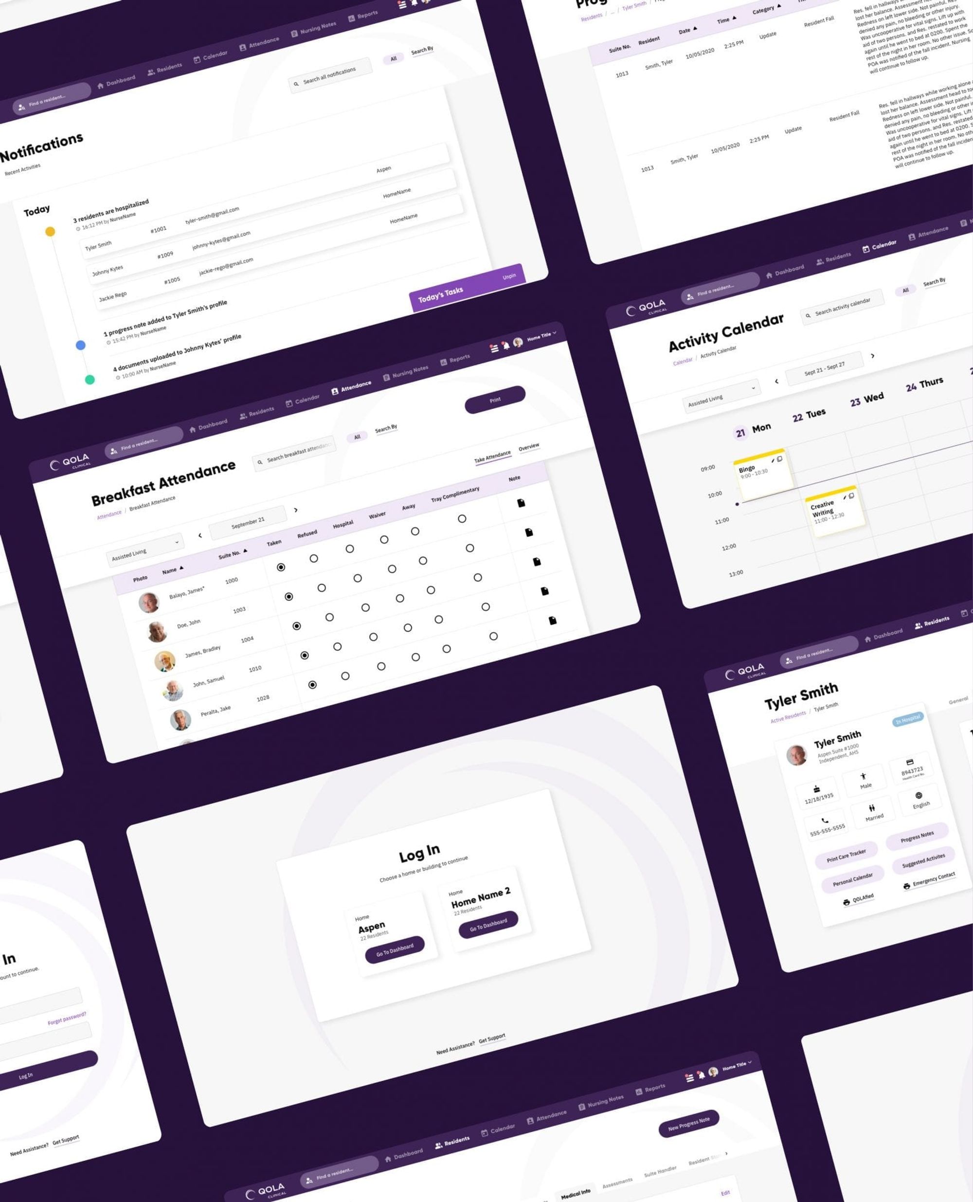
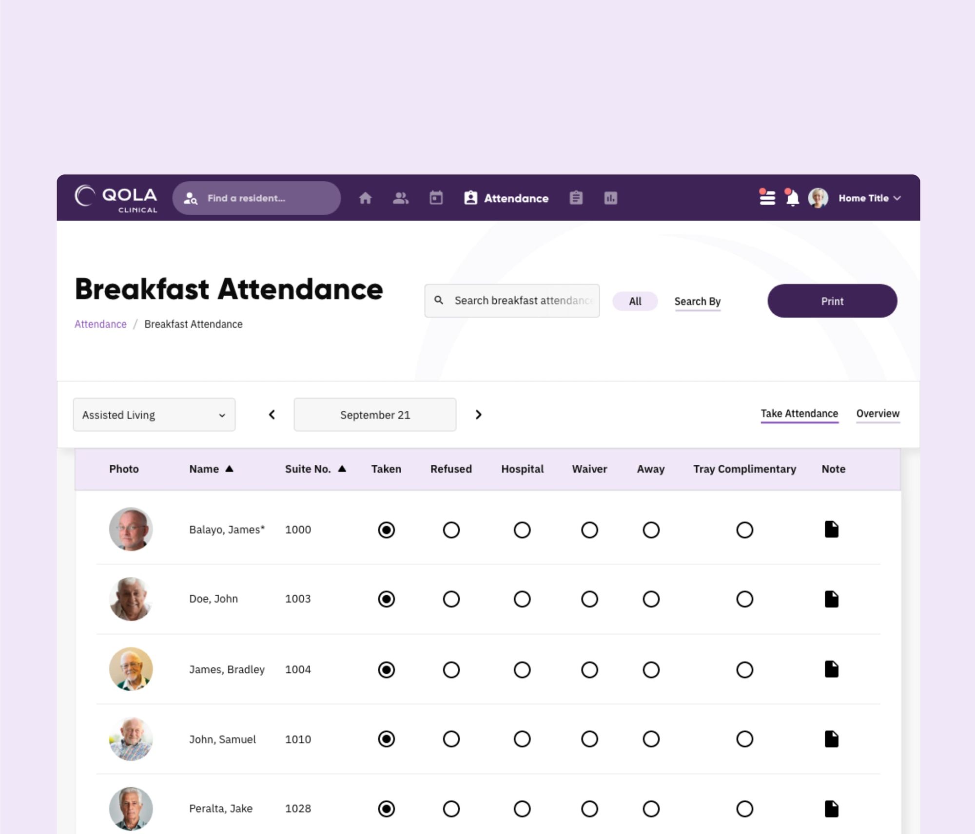
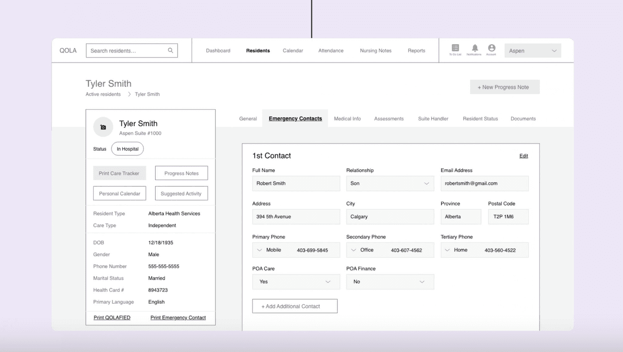
The app prioritizes on-hand guidance and strong information scent. These pages detailed everything from breakfast attendance rosters to confidential data about residents and their families. We really ensured that we did not neglect any page or interaction data during the redesign.
After collating this information, we restructured the app and made it scalable. As such, Qola could continue to expand without having to generate new tech issues.
We made the app more nurse-centric instead of resident-centric and structured it around nurses’ workflow.
Prototyping
Visual Designs
To add the finishing touches to our project, we came up with a gorgeous purple interface design for the Qola App. The theme for our wireframes is timeless and accessible, ensuring that users look forward to logging in and feel confident in using Qola’s services.
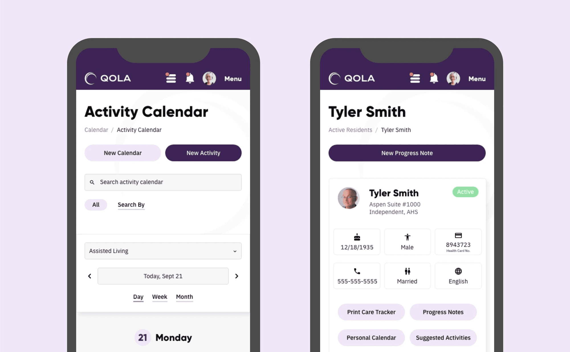


In making the app more usable, Qola could also slash onboarding costs for new customers and avoid having to deliver time-consuming training sessions. Qola’s platform is now super easy to use, giving users access to intuitive timetables, confidential information, and more without compromising user safety and security
If I only shared one thing I’ve learned
Complex doesn't always mean bad and it's not always equivalent to something that is complicated and confusing.

Template by Sinda Bouzir